If you’ve spent more than five minutes scrolling through design blogs or checking into high-end coastal properties, you’ve seen her work. Kelly Wearstler isn't just a designer; she’s a force of nature in the world of boutique hotel interior design. Often called the "Queen of Maximalism," she has redefined what it means to stay in a luxury space.
At My Hotel Design, we’re obsessed with how spaces make people feel. And nobody makes people feel quite as energized as Kelly. Whether it’s a lobby that looks like a high-end art gallery or a suite that feels like a chic 1970s apartment, her work is a masterclass in breaking the rules and making it look easy.
In this guide, we’re going to break down the Wearstler "secret sauce." If you’re looking to elevate your property’s aesthetic or just want to understand why her designs work so well, you’re in the right place.
The Philosophy: Embracing "Beautiful Tension"
Most designers try to make everything match. They want the rug to "talk" to the curtains and the chairs to "agree" with the walls. Kelly Wearstler does the opposite. She looks for what she calls "beautiful tension."
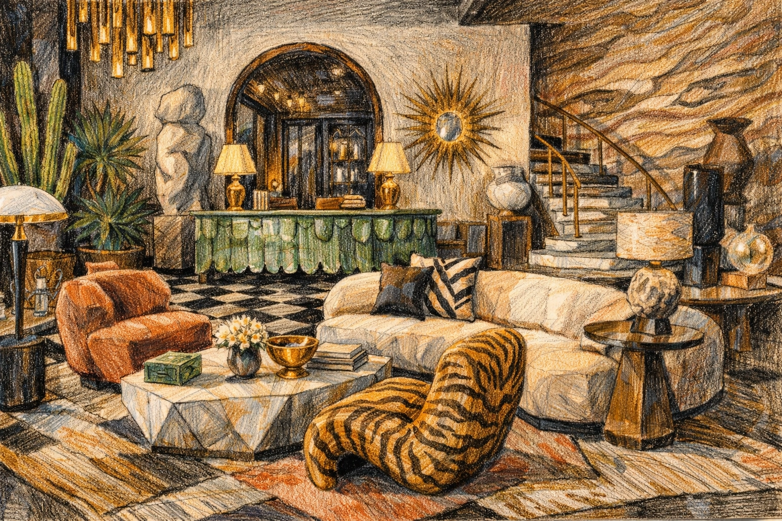
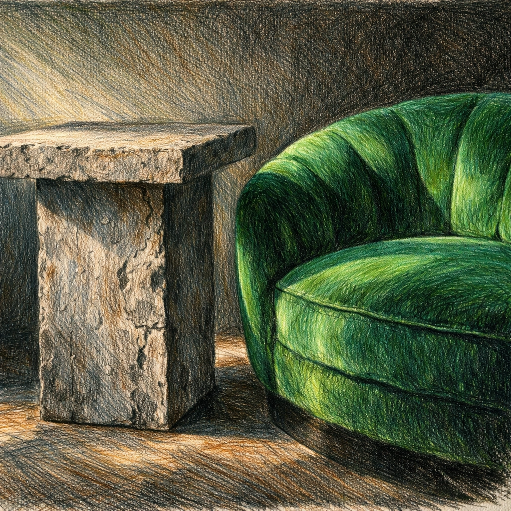
This is the strategic contrast between opposing elements. It’s putting a raw, brutalist concrete table next to a soft, velvet-upholstered chair. It’s mixing a 17th-century French bust with a neon-colored geometric painting. This tension creates a space that feels alive and curated over time, rather than something that was bought out of a single catalog.
In luxury hospitality design, this approach is gold. Why? Because it makes the guest feel like they are somewhere unique. It removes the "cookie-cutter" feeling that plagues so many mid-market hotels.
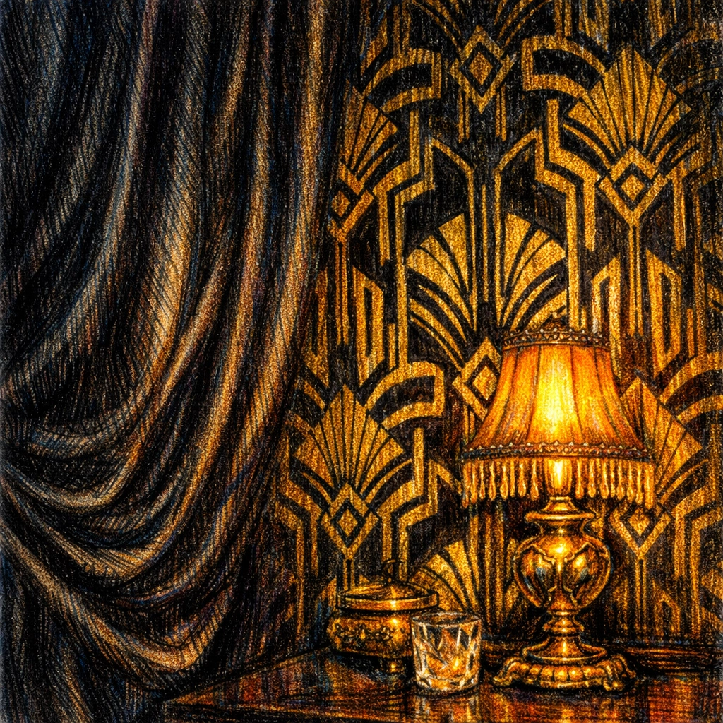
Key Principle 1: Layering Like a Pro
Wearstler doesn’t just decorate; she layers. She views a room like a piece of music. You have the bass line (the architecture), the melody (the furniture), and the riffs (the accessories and patterns).
Color and Pattern
She is famous for her fearless use of color. When she designed the Maison 140 hotel in Hollywood, she painted the corridors black. At the time, people told her it would be depressing. Instead, it became one of the most Instagrammed and talked-about features of the hotel because it felt intimate and rebellious.
Her trick for layering patterns is to treat them like different scales. You might have a large-scale marble floor, a medium-scale geometric wallcover, and a small-scale textile on the pillows. When the scales vary, they don’t compete; they dance.
Materiality
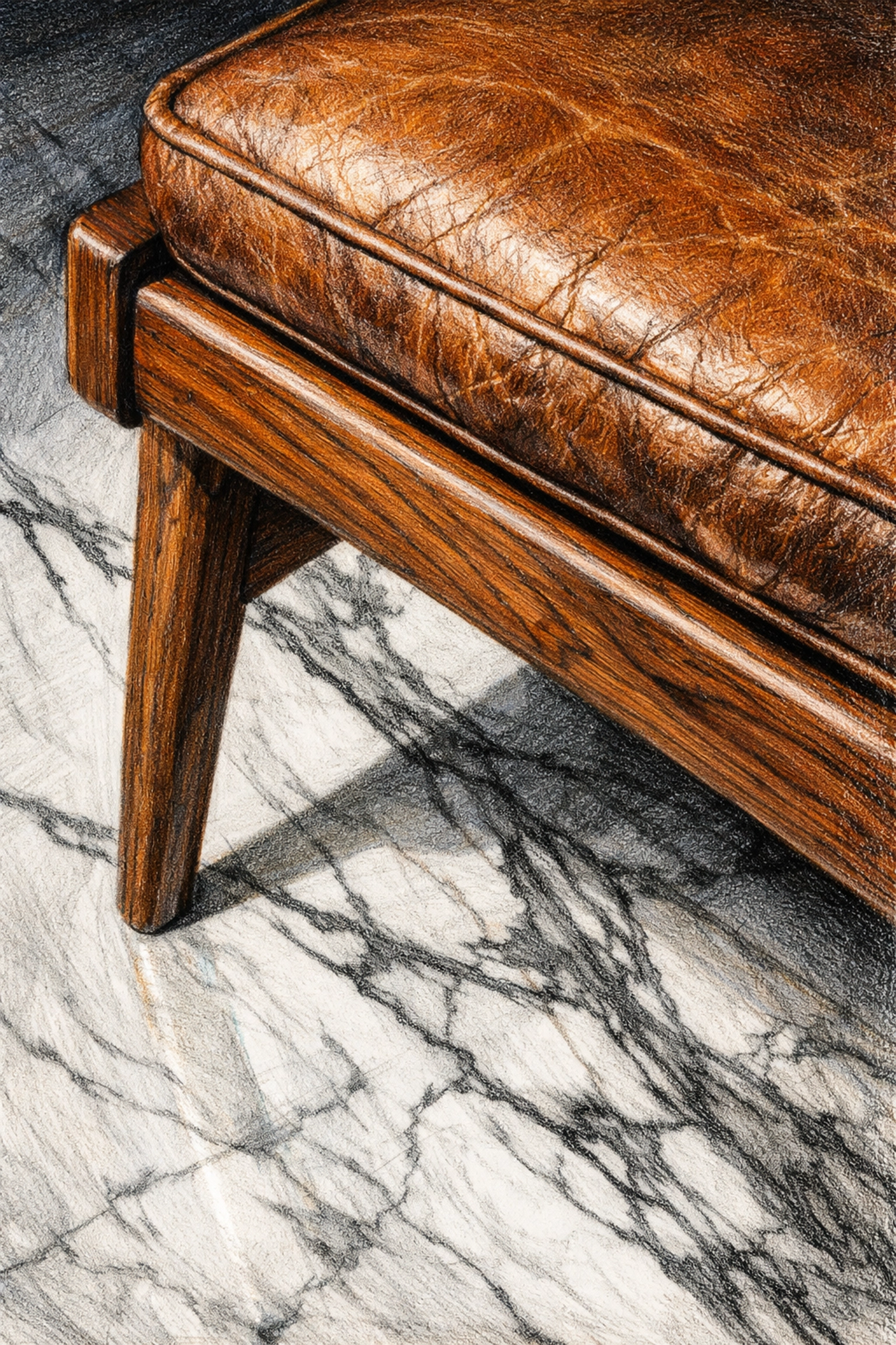
In sustainable hotel architecture, we often talk about the longevity of materials. Wearstler is a master of using "real" materials: stone, wood, metal, and leather. By mixing these textures, she creates a tactile experience. A guest doesn't just see the room; they feel it.
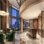
The Proper Influence: Redefining the Modern Boutique Hotel
If you want to see Wearstler's philosophy in action today, look no further than the Proper Hotel brand. From San Francisco to Austin and Downtown L.A., these properties have set a new standard for boutique hotel interior design.
Santa Monica Proper
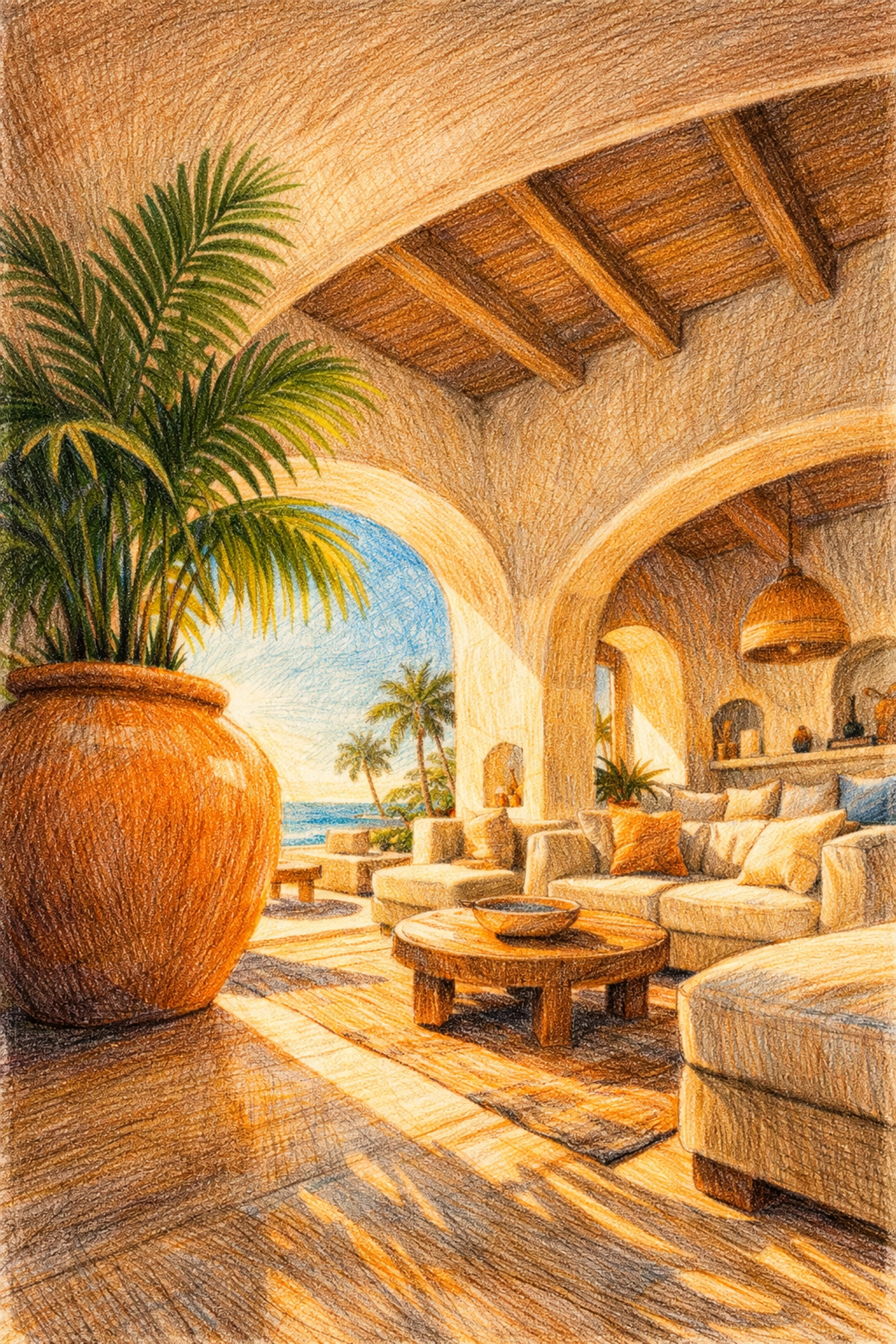
This hotel is a perfect example of how she incorporates local context. Instead of a generic "beach theme," she used sandy tones, organic shapes, and a massive amount of indoor greenery to bring the California coast inside in a sophisticated way. It feels like a luxury residence that just happens to have 271 rooms.
Downtown L.A. Proper
Here, she took a historic YMCA building and leaned into its heritage. She didn't erase the history; she gave it a "new spirit." One of the standout features is a collaboration with artist Ben Medansky: an 80-foot ceramic tile wall in the pool suite. This focus on site-specific art is a hallmark of her work. It bridges the gap between a commercial space and a private art collection.
Why It Matters for Your Hotel Project
You might be thinking, "That’s great, Robert, but I don't have a Wearstler budget."
The good news is that her principles can be applied at any level. You don't need a million-dollar art budget to embrace "beautiful tension." Here is how you can use her 101 rules to improve your own hospitality project:
- Stop Symmetrizing: If you have two bedside tables, they don't have to be identical. Try two different shapes in the same material. It adds an instant "designer" feel.
- Focus on the Entryway: The lobby is your first and last chance to make an impression. Use a bold, statement light fixture or a unique floor pattern to anchor the space.
- Mix Eras: Don't buy all your furniture from one era. Mix a few vintage pieces (which is also a great win for sustainable hotel architecture) with modern, clean-lined sofas.
- Local Artisans: Wearstler works with local ceramicists and woodworkers. Find someone in your city to create a custom piece for your lobby. It tells a story that a mass-produced item never could.
Luxury Hospitality Design and Sustainability
In 2026, we can't talk about design without talking about the planet. Interestingly, Kelly Wearstler’s style leans into sustainability more than people realize.
By using vintage furniture and "honest" materials like marble and solid wood, she creates interiors that age gracefully. A plastic chair might look dated or broken in three years, but a vintage mid-century chair only gains character. This "buy once, buy well" mentality is a core pillar of sustainable hotel architecture. When we design spaces that people don't want to tear down in five years, we reduce waste and create lasting value.
The Power of the Unexpected
One of my favorite things about Kelly’s work is her use of the "unexpected." She loves off-center placements and mismatched arrangements. In a world where most hotel rooms look like they were generated by an algorithm, a little bit of "weirdness" is actually very comforting. It feels human.
For example, in many of her designs, she’ll place a giant oversized lamp on a small side table, or hang art much lower than you’d expect. These small "errors" in traditional design are what make her spaces feel residential and high-end.
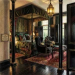
Case Study: Maison 140
Let’s go back to Maison 140 for a second. This was one of the projects that put her on the map. It was a tiny footprint with a limited budget. Instead of trying to make the rooms look "bigger" by painting them white (the standard advice), she leaned into the smallness.
She used bold wallpapers, heavy fabrics, and that famous black hallway to create a "jewel box" effect. It taught the industry that boutique hotel interior design isn't about square footage; it's about the density of the experience.
Final Thoughts: Finding Your Own Tension
Kelly Wearstler's 101 is ultimately about confidence. It’s the confidence to trust that a space doesn't have to be "perfect" to be beautiful. It just has to be intentional.
If you’re planning a new hotel or renovating an old one, take a page out of her book. Don't be afraid of a little tension. Mix that old architectural detail with a super-modern light fixture. Layer that pattern you love over a textured rug.
At My Hotel Design, we believe that every hotel has a story. Whether you want a space that is loud and proud like a Wearstler masterpiece or something a bit more subdued, the goal remains the same: create a place that guests will remember long after they’ve checked out.
Want to chat more about how to bring some of these design principles to your property? Give us a shout. We love talking shop.
: Robert Rupp, Founder, My Hotel Design