If you’ve stepped into a high-end boutique hotel in the last twenty years and felt like you were walking through a living art gallery rather than a lobby, there is a very good chance you have Kelly Wearstler to thank.
In the world of boutique hotel interior design, few names carry as much weight. While some designers are known for a specific "look," Wearstler is known for a feeling: a sense of bold, unapologetic luxury that somehow manages to feel both ancient and futuristic at the same time. At My Hotel Design, we’re constantly looking at the giants of the industry to see how they shape guest experiences. Today, we’re diving deep into the world of Kelly Wearstler to understand how she didn't just design hotels; she revolutionized the way we think about hospitality.
The Designer Who Broke the Rules
Before Kelly Wearstler arrived on the scene in the late 90s and early 2000s, luxury hospitality design was, frankly, a bit predictable. You had your "grand dame" hotels with heavy drapes and gold leaf, and you had "minimalist" hotels that felt a little like high-end hospitals.
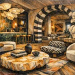
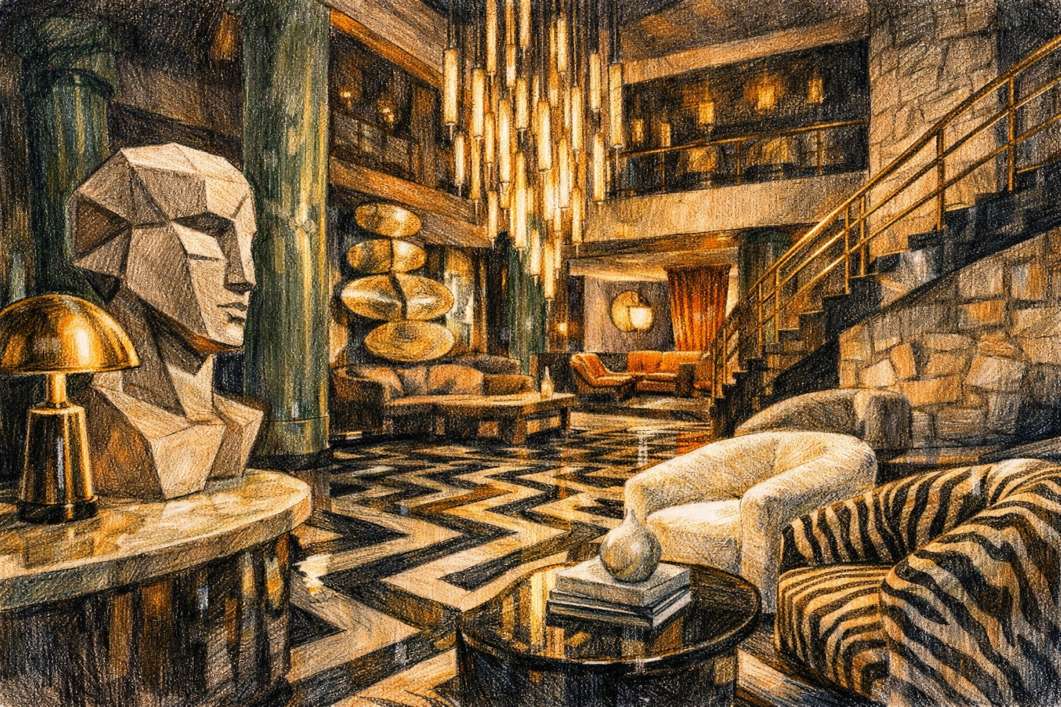
Wearstler threw the rulebook out the window. She introduced what many call "Modern Mid-Century Maximalism," but even that doesn't quite cover it. She started mixing patterns that shouldn't work together, blending rough-hewn stone with polished brass, and placing 1970s Italian furniture next to Greek statues.
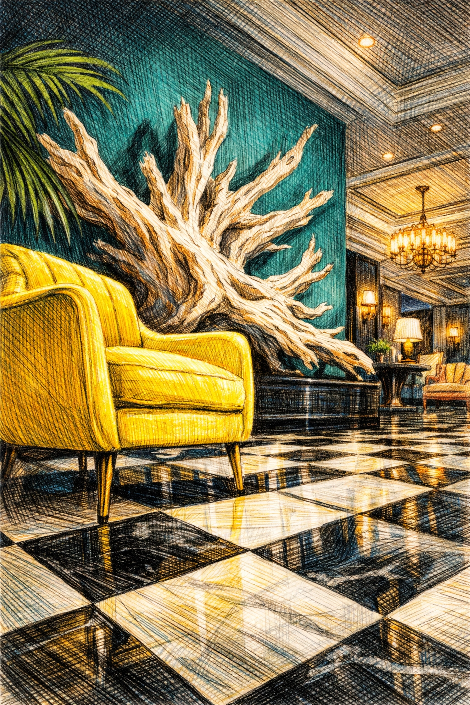
Her breakthrough came with the Viceroy Santa Monica. At the time, nobody was doing "Regency-meets-beach-house." It was bold, it was bright yellow, and it was an instant icon. It proved that a hotel could be a destination in itself, not just a place to sleep.
The Proper Evolution: A Masterclass in Local Flavor
If the Viceroy era was about bold colors and glamour, her work with the Proper Hotel brand represents a more mature, textured, and site-specific evolution of luxury hospitality design.
What makes the Proper Hotels in San Francisco, Santa Monica, and Austin so special is how Wearstler treats the location. She doesn't just "drop" a design into a city. She researches the history of the building and the vibe of the neighborhood.
San Francisco Proper
Located in a historic flatiron building, this hotel is a masterclass in layering. Wearstler used over 100 different wallpapers and a mix of vintage European furniture. It feels like the home of a very wealthy, very eccentric world traveler. This project showed the industry that boutique hotel interior design doesn't have to be "safe" to be successful.
Santa Monica Proper
Here, the vibe shifts to organic and earthy. It’s a softer side of her style, focusing on neutral tones, raw woods, and incredible textures. It feels like the beach, but elevated to a level of sophistication that most coastal resorts can only dream of.
Why "The Wearstler Look" Works
So, why is everyone still talking about her in 2026? It comes down to three main factors:
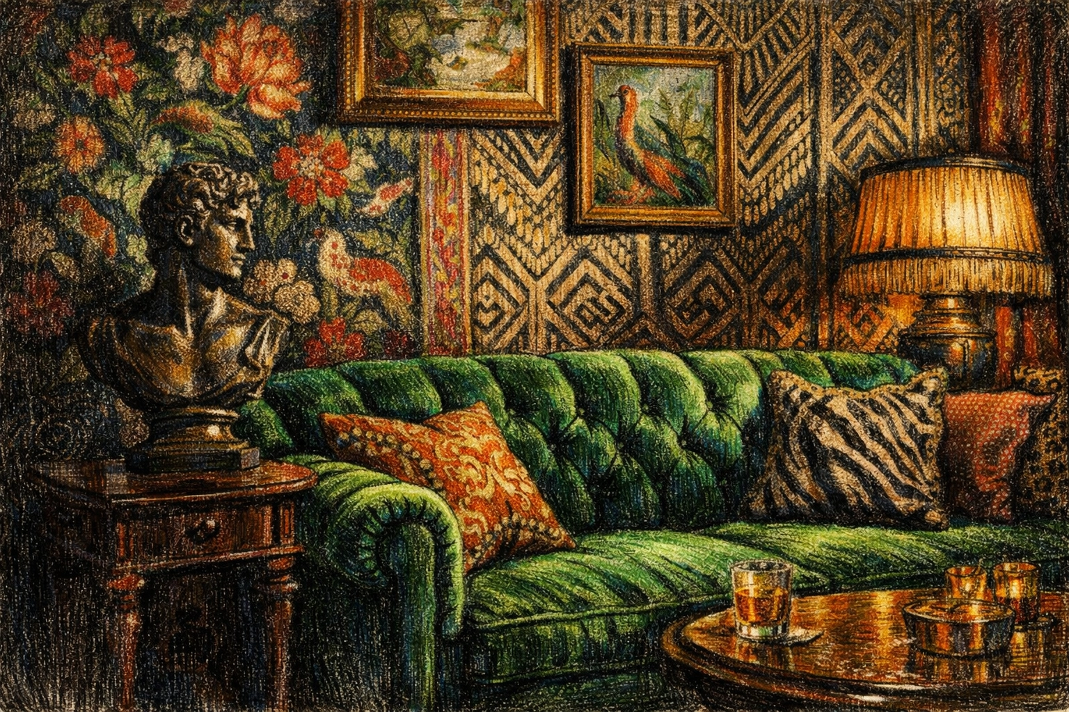
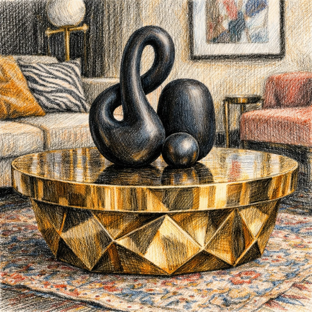
- Materiality and Texture: Wearstler is a master of materials. She’ll use a slab of marble that looks like a painting, then pair it with a nubby wool rug and a hand-carved wooden chair. This tactile variety makes a space feel "expensive" without being cold.
- Sensory Storytelling: When you walk into one of her hotels, your brain has to work a little. There is so much to look at and touch. This creates a memorable experience: which is exactly what boutique hotels need to compete with big chains.
- The "Instagram" Factor (Before it was a thing): Long before people were choosing hotels based on their photo potential, Wearstler was creating "moments." Whether it's a dramatic staircase or a funky bathroom mirror, her designs are inherently shareable.
Sustainable Hotel Architecture and the Wearstler Method
You might not immediately associate maximalism with sustainable hotel architecture, but Wearstler’s approach actually leans heavily into sustainability in a few clever ways.
First, she is a huge proponent of vintage and antique sourcing. Instead of filling a hotel with 500 identical mass-produced chairs from a factory, she often hunts for unique pieces that have already stood the test of time. This "reuse and upcycle" philosophy at scale reduces the carbon footprint of the interior fit-out.
Secondly, her focus on "honesty of materials" means using things that age gracefully. Rather than using cheap synthetic finishes that need to be replaced every five years, she uses stone, wood, and metal. These materials develop a patina over time, becoming more beautiful as they age. In the world of luxury hospitality design, longevity is one of the most sustainable choices a designer can make.
Key Projects to Study
If you’re looking for inspiration for your own project, here are the "Big Three" Kelly Wearstler projects that changed the industry:
- Viceroy Anguilla (now Four Seasons): This project redefined Caribbean luxury. Instead of the typical "tropical" clichés (blue and white, wicker furniture), she used organic textures, driftwood tones, and massive stone elements. It brought a sense of sophisticated brutalism to the beach.
- Austin Proper: This hotel perfectly captures the "New South." It mixes traditional patterns with modern silhouettes. The use of local artisans and materials makes it feel deeply rooted in Texas, rather than a copy-paste luxury hotel.
- The Tides Miami: This was one of the first projects where she really showed how to handle a historic Art Deco property. She kept the soul of the building but updated it for a modern, high-fashion crowd.
How to Bring the Wearstler Influence to Your Hotel
You don't need a multi-million dollar art budget to take cues from Kelly Wearstler. Here is how we at My Hotel Design think about applying her philosophy to smaller-scale boutique projects:
- Don't match, coordinate: Stop trying to make sure all your wood tones match. Mix light oak with dark walnut. Mix chrome with brass. It creates a "collected" look that feels more authentic.
- Invest in "Hero" pieces: You might have a modest budget for the guest rooms, but make the lobby desk or the elevator landing a showstopper. One incredible piece of furniture or a bold wallpaper can set the tone for the whole stay.
- Focus on the touch: When selecting fabrics, think about how they feel. A velvet headboard or a textured linen curtain adds a layer of luxury that guests can literally feel.
- Celebrate the architecture: If your building has "quirks": like exposed pipes, uneven walls, or weird corners: don't hide them. Work with them. Wearstler’s best work often comes from leaning into the "weirdness" of a space.
The Future of Hospitality Design
As we move further into 2026, the trend in boutique hotel interior design is moving toward "Hyper-Personalization." Guests want to feel like they are staying in a place that has a soul. They are tired of the "cookie-cutter" luxury that you can find in any city in the world.
Kelly Wearstler paved the way for this. She showed the industry that you can be weird, you can be bold, and you can be "too much": and guests will love you for it. By prioritizing the "art" of the interior, she turned hotels from service providers into cultural landmarks.
Whether you love her style or find it a bit overwhelming, there’s no denying that she changed the game. She taught us that a hotel shouldn't just be a place to rest your head; it should be a place that wakes up your imagination.
Are you looking to redefine your hotel's interior?
At My Hotel Design, we specialize in creating spaces that tell a story. Whether you’re aiming for the bold maximalism of a Wearstler project or a more grounded, sustainable approach, we’re here to help you build something iconic. Reach out to us today to start the conversation.